Resource Utilization
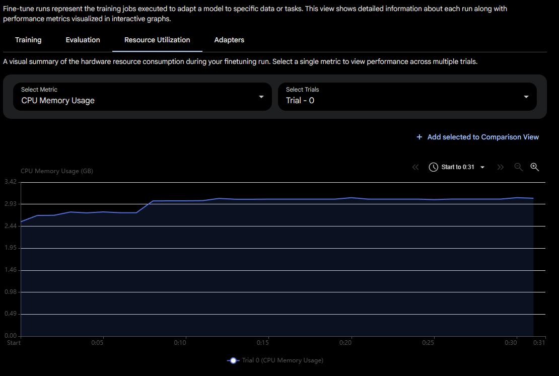
The Resource Utilization tab of a fine-tune run is a visual summary of how much hardware a run consumed while it trained. It plots a single hardware metric over the lifetime of the run so you can see, second by second, how memory and compute were used. This matters because a fine-tune competes for finite GPU and CPU resources: reading these graphs tells you whether a run is comfortably within its node's capacity, whether it is close to exhausting memory, and whether the hardware is being used efficiently or sitting idle. You reach it from an open fine-tune run, alongside the Training, Evaluation, and Adapters tabs.
 Snapshot of Protean AI Platform
Selecting a Metric
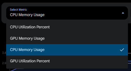
The Select Metric dropdown chooses which hardware measurement the graph plots, and only one metric is shown at a time so the chart stays readable. You pick the metric that answers the question you have right now, for example switching to a memory metric when you suspect a run is close to running out of VRAM, or to a utilization metric when you want to know whether the GPU is actually being kept busy. The available metrics are:
- CPU Utilization Percent: how hard the CPU is working, as a percentage of its capacity.
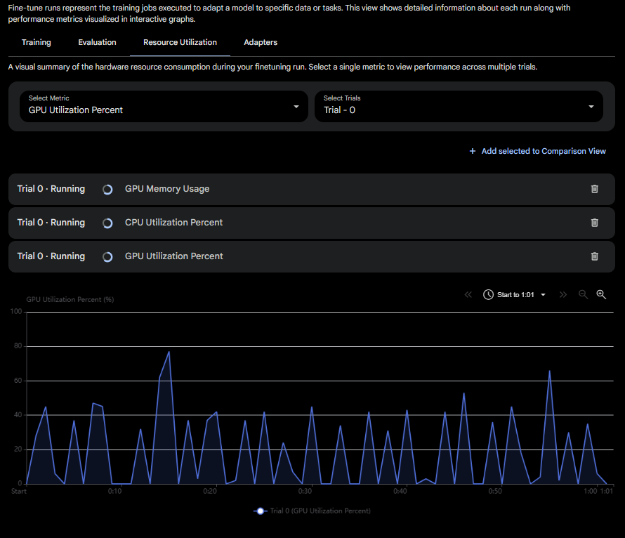
- GPU Utilization Percent: how hard the GPU is working, as a percentage of its capacity. Low values here during training can indicate the GPU is waiting on data rather than computing.
- CPU Memory Usage: how much system memory (RAM), in gigabytes, the run is holding.
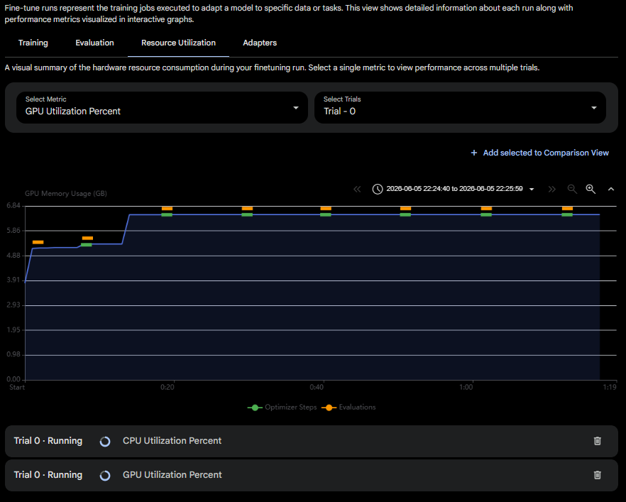
- GPU Memory Usage: how much GPU memory (VRAM), in gigabytes, the run is holding. This is the metric to watch when a run is at risk of an out-of-memory failure.
 Snapshot of Protean AI Platform
Selecting Trials
The Select Trials dropdown chooses which trial of the run the graph draws. A run can contain several trials (for example, during a hyperparameter search), and each trial has its own hardware profile. You select the trial you want to inspect so the chart reflects that trial's consumption rather than another's. The trial's running or completed state is shown alongside its name, so you can tell whether the line you are looking at is still being extended with live data.
Reading the Graph
The chart plots the chosen metric on the vertical axis against elapsed time on the horizontal axis, starting from the moment the run began. A toolbar above the chart lets you control the window you are looking at:
- Time range control: the clock control shows the span currently in view (for example, the start of the run through a later timestamp). Use it to focus on a specific stretch of the run rather than the whole timeline.
- Paging arrows: the
<<and>>controls step the visible window backward and forward through the run's timeline, which is useful for long runs where the whole history does not fit on screen at once. - Zoom: the magnifier controls zoom the time axis in and out, trading overall context for finer detail.
On memory metrics, the line is annotated with markers that tie hardware usage back to what the training was doing at that moment:
- Optimizer Steps markers (shown in green) indicate where optimizer steps occurred.
- Evaluations markers (shown in orange) indicate where evaluations ran.
These markers let you correlate spikes or jumps in memory against the events that caused them, for instance seeing memory rise when an evaluation kicks in.
Comparison View
A single chart shows one metric for one trial, but understanding a run often means looking at several metrics together. The Add selected to Comparison View action takes the metric and trial currently selected and pins it into a comparison list, so you can build up a stack of measurements and view them side by side instead of flipping the dropdown back and forth.
 Snapshot of Protean AI Platform
Each entry you add appears as a row identifying the trial, its running or completed state, and the metric it represents, with a delete control to remove it from the comparison again. Selecting an entry draws its graph, so you can move through the metrics you have collected and compare how, say, GPU memory and GPU utilization moved over the same run.
 Snapshot of Protean AI Platform
Use the comparison view when a single metric is not enough to explain a run's behavior, for example to check whether high memory usage lines up with high GPU utilization, or to compare the same metric between a still-running trial and one that has finished.
Workflow
- Open a fine-tune run and select the Resource Utilization tab.
- Choose a Metric and a Trial to plot.
- Read the graph, using the time range, paging, and zoom controls to focus on the stretch you care about, and the Optimizer Steps and Evaluations markers to correlate usage with training events.
- Select Add selected to Comparison View to pin metrics you want to keep, then step through the comparison list to view them together.
Result
The Resource Utilization tab gives you an interactive, time-aligned picture of a fine-tune run's CPU and GPU memory and utilization, both for a single metric and across a comparison set. It lets you confirm a run fit comfortably on its hardware, diagnose out-of-memory or under-utilization problems, and tie resource behavior back to the optimizer steps and evaluations that drove it.